10
Your Website Must Have a Great Call to Action

Attracting prospective patients to your website can be challenging. Especially in larger towns and cities where people have more options when it comes to selecting a dental care provider.
The necessity to stand out from the competition is why so much emphasis is placed on digital marketing efforts like search engine optimization (SEO), pay-per-click (PPC), and social media marketing. But a practice’s website itself plays an equally important role in the new patient process.
Keep reading to learn how to nudge prospective patients towards becoming new patients at your practice.
What is a call to action?
Website visits from prospective patients are worthless on their own. A practice’s website must clearly show people what services the practice can provide for them AND articulate the next step in the process.
A great website doesn’t make visitors guess what action they should take – it clearly illustrates the action. The call to action provides a clear direction prompting visitors to take a specific action.
Without a directive that can be followed, visitors will reach your website, be unsure of what the next step towards becoming a patient should be, and leave the website without taking any further action. People don’t change dental providers often and the process is frankly not intuitive, so they need to be shown what to do next rather than have to guess on their own.
What are some examples?
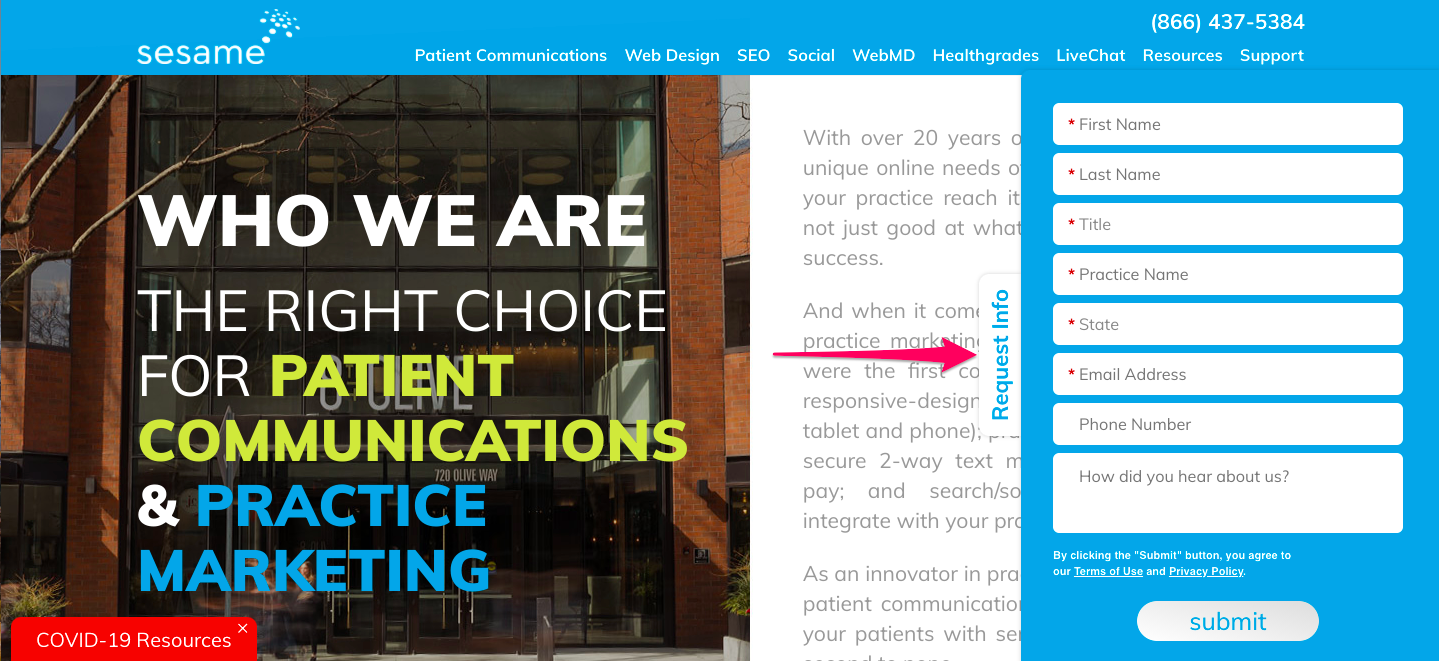
The most common call to action is a “Contact Us” or “Request Info” link or button. Every website should have a Contact Us option listed either prominently within the navigation bar at the top or in an obvious location throughout every page on the website.
For example, Sesame uses a “Request Info” bar that lives on the right side of each page within the website and scrolls along with a visitor’s movements on a given page. If someone clicks the button the form expands as in the following example.
The more obvious the location, the better. A “Get a Free Consultation!” button front-and-center on the homepage, for example, is very visible and compelling.
Think about what action you want prospective patients to take and have that action (think “Contact Us,” a “Learn More” button that links to a contact form, etc.) be very visible on your website.
In short, an excellent call to action will help more visitors to your website take requisite steps towards eventually becoming patients. If you’re unsure of how effective the call or calls to action on your website are, please feel free to contact us!
—Mike Fitterer, Sr. Marketing Manager II, Sesame Communications