28
Why does my site need to be mobile friendly?
What is changing the landscape of the Internet? Hint: It’s something you probably use on a daily basis.
Mobile devices, such as smartphones and tablets, are changing the way we consume the Internet. In fact 81% of people prefer searching the Internet on their mobile device for its convenience and speed (Vocus Blog).
Is Your Website Mobile-Friendly?
Take out your smartphone and pull up your practice website. How does it look? Are you scrolling to find the practice phone number?
If your site isn’t mobile-friendly, you’re missing out on a growing audience of potential patients. Patients are using their smartphones and tablets to seek information about your practice while on-the-go, expecting to find what they’re looking for quickly and easily.
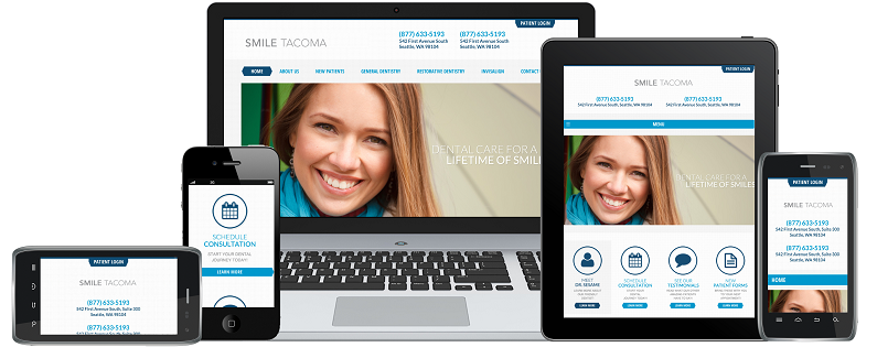
A way for you to connect with patients no matter the device they use is with Responsive Web Design. Responsive design allows you to deploy one website to connect with patients on multiple devices. This means that a prospective patient could be using an iPad, smartphone, or Kindle and your website will look great and function beautifully.
Want to learn how responsive web design can benefit your practice? Take a look at the latest Sesame Guide to Practice Success: 5 Reasons your Practice Needs a Responsive Website Now.