04
Quick Tips for Getting More Contact Form Submissions
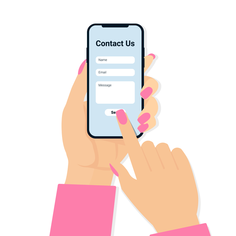
Encouraging people to fill out a contact form seems straight-forward, right? A person fills out their information, hits submit, and an automated notification email with the included information is sent to your practice.
Yet, it’s highly likely that MANY would-be prospective patients are not filling out your online contact forms because of some subtle issues.
In this post, I’ll provide some simple recommendations for getting more people to fill out your practice’s contact form.
Limit Form Fields
The fewer the number of form fields the better your conversion rate will be.
Why? Because when people see many fields on a page, completing them becomes a daunting process, and they are therefore more likely to give up.
In the example below, which is a Sesame form, we only include first and last name, Company Name, Email, and State.
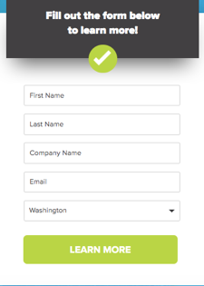
As a practice, fields like “Company Name” and even “State” are probably irrelevant. If you limit your contact forms to just Name, Email, and Phone Number you’ll get a far greater volume of people submitting their information.
There is one catch, though. Having fewer form fields makes it easier for SPAM bots to target your forms. If SPAM becomes an issue you can always add a CAPTCHA box so people have to write in a word or identify pictures before submitting their info. While a CAPTCHA addition will add a step for actual people it will definitely help prevent bot submissions.
Button Color Matters
The color you pick for submit buttons is actually important. Website visitors must be drawn to the form submit button on a given page in order to fill out the form and submit their info.
Consider using a color that is only minimally reflected on a page (like a logo color) as the button color so that it stands out. Lighter colors should be used, as they typically perform best.
Wording on the Button is Important
Label buttons with what they do. Being direct with wording will lead to improved performance.
Having the button say “Make an Appointment,” Learn More,” or “Request a Free Consultation” is great and can add relevance depending on the situation.
However, you will want to be mindful of character count. Make sure the wording isn’t too many characters, as having a long button is likely to make the entire form look awkward and detract people from supplying their information.
Be Clear About Steps
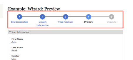
If you must collect a lot of info up-front set expectations for the number of steps there will be.
How can this be achieved? Try a progress bar. For example, as in the image below you can show people where they are in the process in order to highlight the progress that has been made. This addition will also reduce the “this is taking forever” mindset that can creep into thoughts when people have to supply a lot of information.
Recap
By making some small form adjustments such as changing the number of information forms you collect or by modifying the wording and color of your form buttons you will give yourself a better chance at getting more people to submit forms on your website. In turn, that should aid in attracting new patients.
If you have any contact form questions please don’t hesitate to reach out to the Sesame Team for further guidance!
—Michael Fitterer, Sr. Marketing Manager, Sesame Communications