29
Responding Responsively: Email Templates
As a Dental/Ortho Sesame member, you’ve made it a priority to maintain the best possible communication between your office and your patients. Email appointment reminders, post-appointment feedback, and financial notifications are effective tools to keep those lines open.
But what good is your email if it can’t be read on a smartphone?
Understanding Mobile Email Trends
Imagine yourself in a room full of people whose faces are illuminated by the glow of smartphone screens. Some will be on Facebook, browsing Pinterest, or watching the latest YouTube cat video. But many will be using their mobile device to check their email.
Now imagine that room covers the entire planet. The Radicati Group reported the number of worldwide mobile email users at 1.4 million—a number they estimate will grow 22% during this year alone.
Why is responsive design important?
Recent studies highlight two highly telling statistics with regard to current email usage:
- Mobile opens account for 46% of all email opens. (Litmus.com)
- When an email does not display correctly on a mobile device, 70% of people will delete it immediately (mapp)
In other words, about two-thirds of your patients will pull up the email you send them on their smartphone. If your email can’t be easily read and understood, it may well end up in the trash.
The importance of using a responsive template for patient email has never been greater.
OS/DS to the Rescue
This is where Sesame’s newly designed templates for responsive email come into play. Your Dental/Ortho Sesame membership gives you access to our unique selection of fresh designs for responsive email templates to send to your patients.
We’ve created emails that work well across all desktop email clients, as well as on all current mobile phones and tablets. This means your appointment-reminder email will look just as worthy of attention whether your patients view it on their desktop at home, a tablet at work, or a smartphone in a coffee shop.
Sesame’s goal is not just to meet, but exceed, expectations when it comes to creating responsive email marketing templates.
- Our designs are modern, clean, and easy to navigate across all platforms (desktop, tablet, mobile, etc.).
- Responsive email adapts to any display size, in any orientation.
- Font sizes change from desktop to mobile displays, so your message is always easy to read.
- Layout can be changed from multi-column (for desktop) to single-column (for mobile) automatically.
- All template content can be easily tailored for your messaging needs.
When your emails look great on your patients’ smartphones, they’ll remember their appointments and show up on time, which means fewer “no shows” for your practice. Patients will also have a much easier time getting access to their Patient Page to view account and financial information, and submitting post-appointment feedback to help you improve their overall experience at your office.
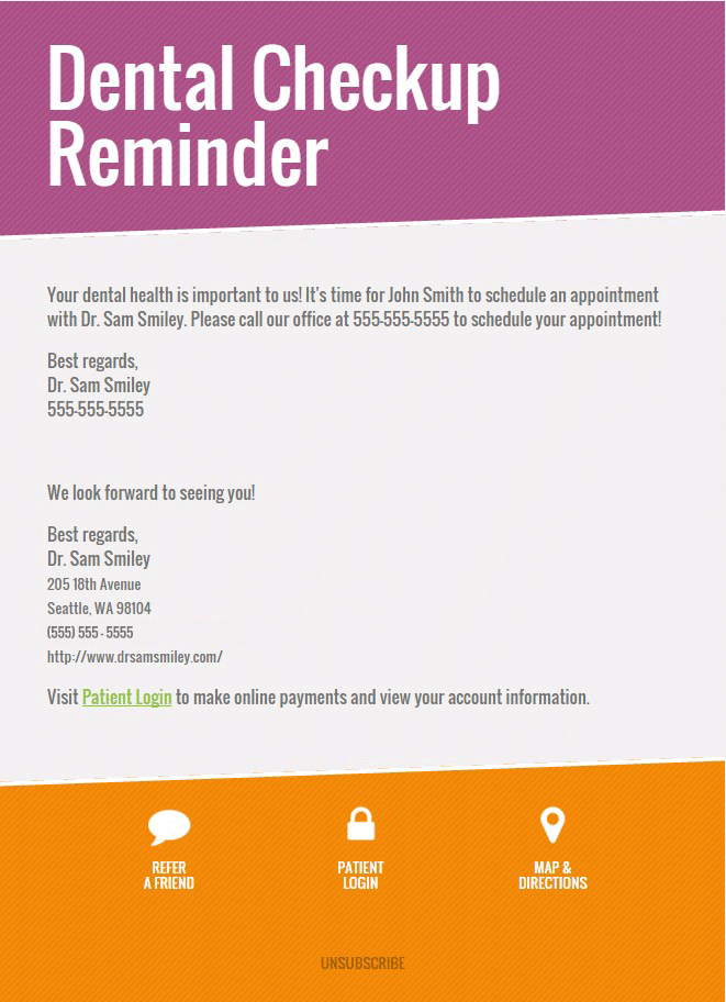
Check out a sample of our new, responsive email templates below!